This week I wanted to show you visually some of the effects we’ve been talking about over the last few weeks.
One of the points I have made (backed up by a Bank of England paper) is that the Government and Central Bank do not try to control the quantity of money. Money is created by banks when they make loans, and the only limitation on the power of the banking system as a whole to do this is the demand for loans, and their own willingness to grant loans to customers.
What effect has this had on our money supply? Here is a graph taken from the Positive Money website, showing the growth since 1969 in bank deposits (these days we could think of this as digital money) and in cash in circulation. They have used Bank of England data on the total money supply and on cash in circulation, taking the latter from the former to get the level of digital money.

What you can see here is rapid growth in the money supply from the early ‘70s, accelerating in pace until the early ‘90s when it slows down (presumably with the crisis in 1992 when Britain crashed out of the ERM) but then starting its rapid and accelerating growth again right up to the last financial crash – with growth being exponential in the years immediately preceding that crash. What we can also see is that all this growth is happening in private bank-created money.
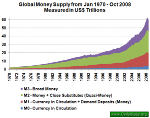
This is not just a UK trend. Here is a graph of global money supply growth, taken from Market Oracle website:
Now one thing you will know from your own experience is that we haven’t suffered exponential inflation in this time. And yet conventional wisdom says that creating new money causes inflation. So what’s going on?
Well first of all, let’s see where all this money was flowing to. Last week I stated that our current monetary system gives private banks the power to decide which sectors of the economy receive newly created money (or to put it another way, have access to bank credit), and that the majority of bank loans are to the property and finance sectors. So let’s see some data on this – again from Positive Money, here is a graph showing levels of UK bank lending to different sectors of the economy:

What we see is that residential mortgages take the largest proportion (about 30%) and if we add in commercial property about 50% of bank loans are going to property. The financial sector then takes 30%.
I argued last week that the continuous cycles of boom and bust in the housing and stock markets is actually inflation caused by the creation of new money flowing into these sectors. (It’s funny how we never talk about “inflation” in share prices – we just see rising prices as a strong market and a good thing!) The last graph shows that new money does indeed flow into these sectors, so here’s another graph showing inflation in these different sectors. This one comes from a blog on investing (Monevator), and the author references another blog which is no longer on-line, so unfortunately I cannot check the source data, but I have no particular reason to doubt it. This graph shows house price, stock market and retail price inflation.

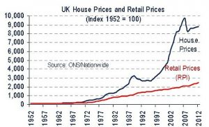
What we see is retail price inflation (the purple line) creeping up since 1956 in the very slow way that we have all experienced when we go shopping. Above it house price inflation (the red line) rises away from RPI in the early ‘80s and then accelerates in the years up to the crash. House price inflation is 4 times more than RPI between 1956 and 2009. This doesn’t sound much, but it’s actually a hugely significant difference: in 2009 houses were 4 times more expensive compared to a basket of shopping than they were in 1959.
This graph, taken from the International Business Times website, only shows house prices and RPI, so you can see the difference much more clearly:
This isn’t as clear on the graph from Monevator because that graph had to fit on share prices, which is where the differences are stratospheric. Share prices take off from the early ‘80s, and although we can see clearly the various financial crashes along the way, these never actually come close to fully deflating the bubble before it starts pumping up again.
I discussed this pattern back in the 2nd week of the blog, when I summarised some statistical findings by Professor Steve Keen in his paper, “A Bubble So Big We Can’t Even See It”. He was using different data, based on US markets, but shows exactly the same pattern. The writer at Monevator seems to be taking this as evidence that shares are the best investment, but Keen points out that we are stuck in a huge, 30-year stock market bubble, and the 3 major crashes in that time didn’t even come close to returning stock prices to a sane level. Here is Keen’s graph again:

If you’ve been following this blog week after week, and you now go back and read my 2nd post again, and indeed Keen’s paper, hopefully you will find it much easier to understand. But that blog post only covered the 1st half of his paper. In the 2nd half Keen analyses the relationship between the value of shares bought with debt (known as margin trading, briefly referred to last week) and stock prices (using the Dow Jones Industrial Average index).
He demonstrates a striking correlation, which you can see in the graphs in the paper. Here is one example:
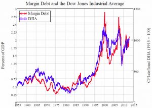
You can see very clearly here the direct correlation between margin trading and stock market prices. Keen is quick to point out that this doesn’t tell us which way causation runs, and that it is likely to run in both directions, with rising stock market prices enticing people to borrow to buy shares. But he does make some pretty convincing arguments that causation also runs the other way. The extent of correlation is striking, and if we accept Keen’s arguments that there is a causative link between margin trading and share prices, this would be an example of the dynamic I outlined in my posts on financial assets, that increasing demand for financial assets can simply push up prices away from their fundamental value, rather than lead to any new investment.
I have been at pains to point out over the weeks that increasing the money supply does not in fact necessarily cause inflation if there is spare capacity in the economy. In a recession, with firms laying off staff or closing down and with little wage growth, increasing demand can stimulate a recovery. But in the stock market supply cannot respond so quickly to increased demand: new shares will only come from public companies deciding to issue new shareholdings or from private companies deciding to go public. An increase in saving through share purchase will simply lead to an inflation of share prices rather than new investment. If this proposition is correct, the correlation between share price and margin trading is what we would expect to see (though showing causation is another matter).
So in summary, what these graphs show is exponential growth in the money supply over the last 35 years, yet no corresponding retail price inflation, but house price inflation that is markedly greater than RPI, and share price inflation that does show the same stratospheric growth as the money supply.
However, a word of caution to finish with. I’m showing you these graphs as a visual way to illustrate what I’ve been telling you on the blog so far. It shows you what is happening in the economy, but I’m not in any way suggesting that this is “proof” or even “evidence” that what I have to say about why it is happening is correct. Perhaps it is weak evidence, in that the data does at least correspond to what I have been saying – if these graphs did not show these trends it would greatly undermine, or even outright disprove, what I have presented so far. But, for example, with the exception of Keen’s graph, there is not a close and direct correlation between inflation in any individual sector and money creation.
And correlation does not prove causation – that’s just bad science. To use data in a scientific way we would have to construct a theory and use it to predict accurately the behaviour of the economy. Economists such as Richard Werner, Wynne Godley and Steve Keen have all done this successfully, and we will look at some of this work briefly in the coming weeks.
All I wanted to do this week was show you visually what I described last week, so please don’t take it as more than that. Next week we are going to look at an even more fundamental problem with our current monetary system.